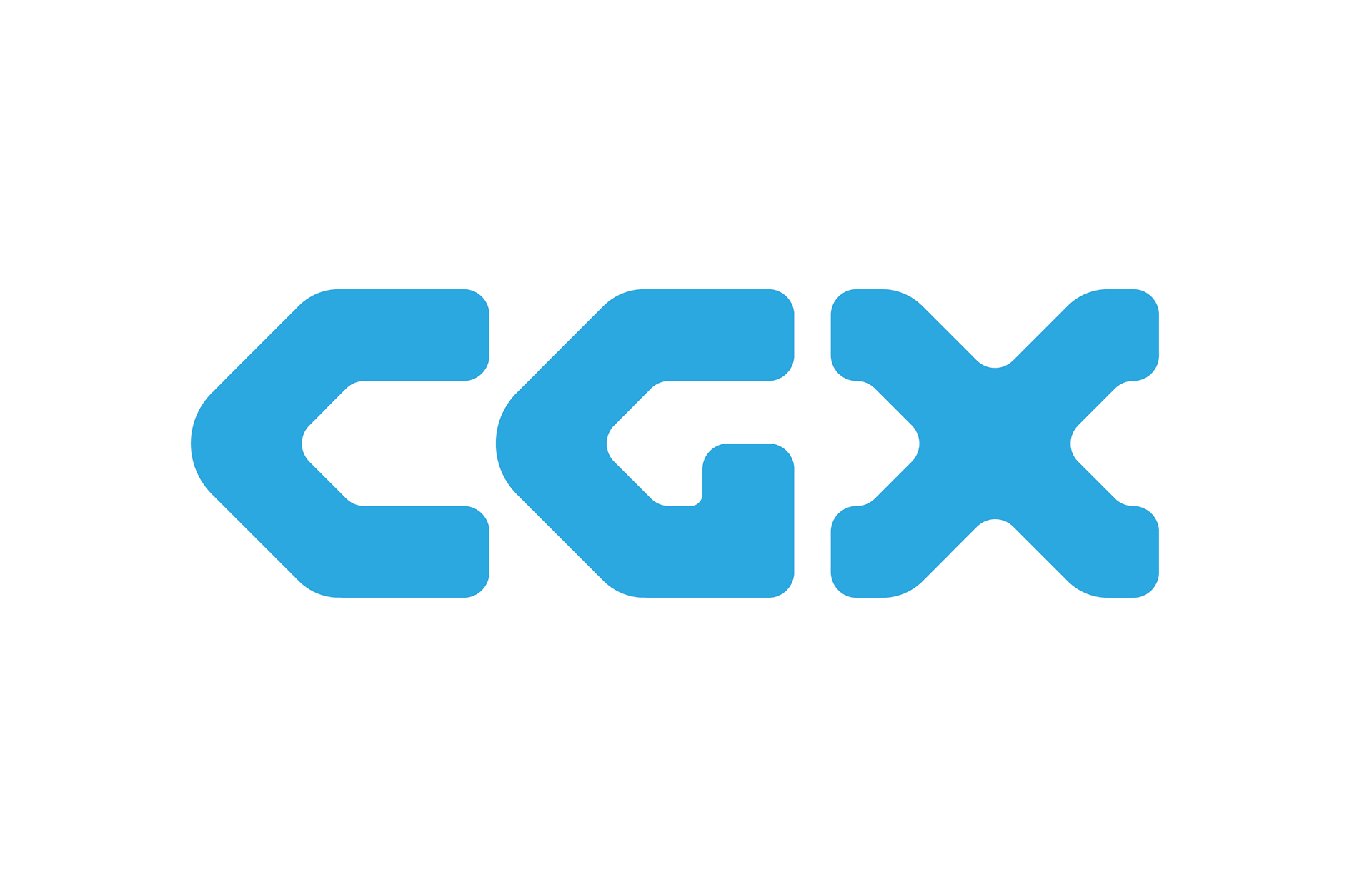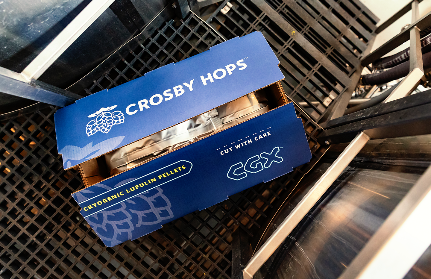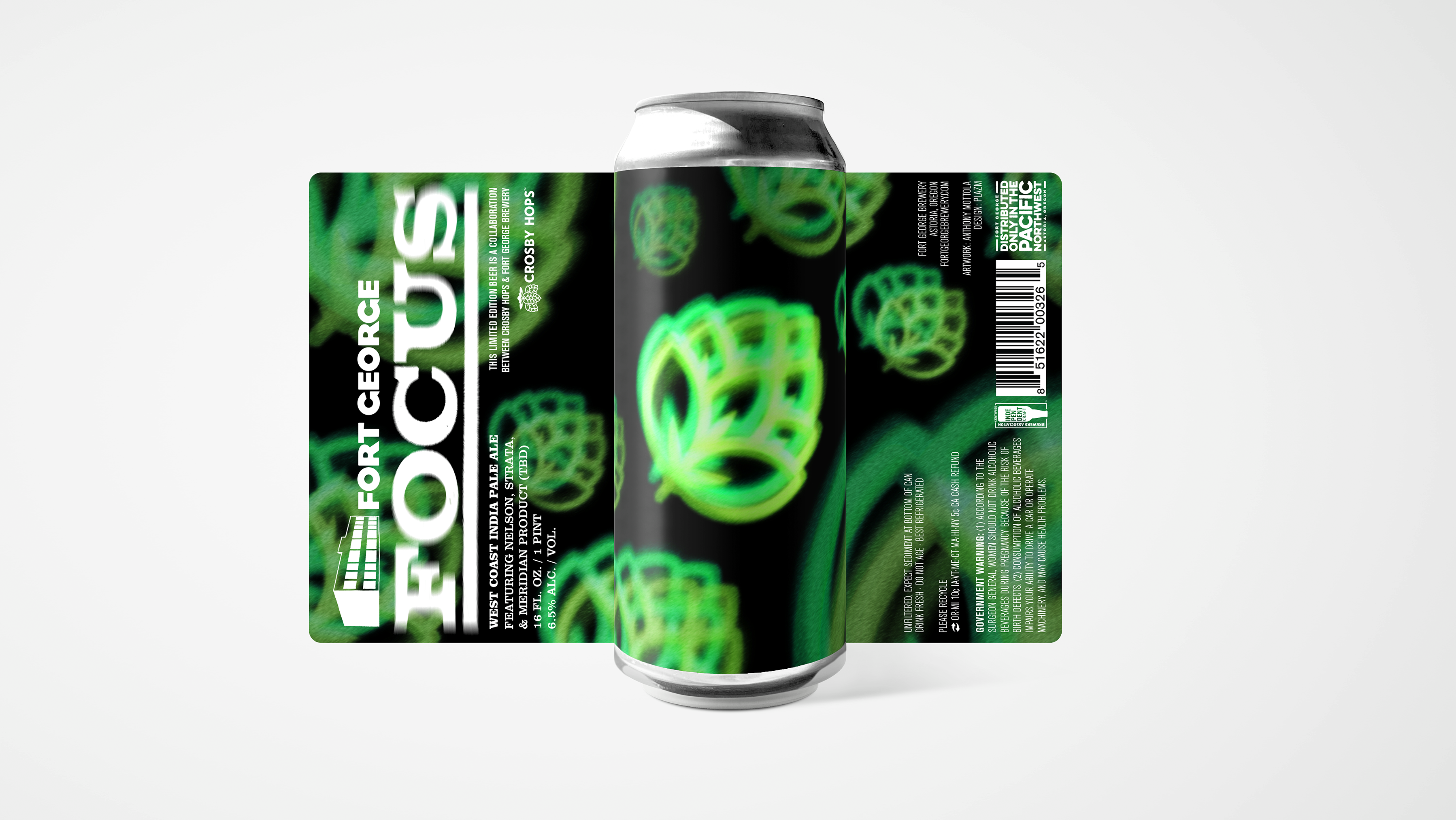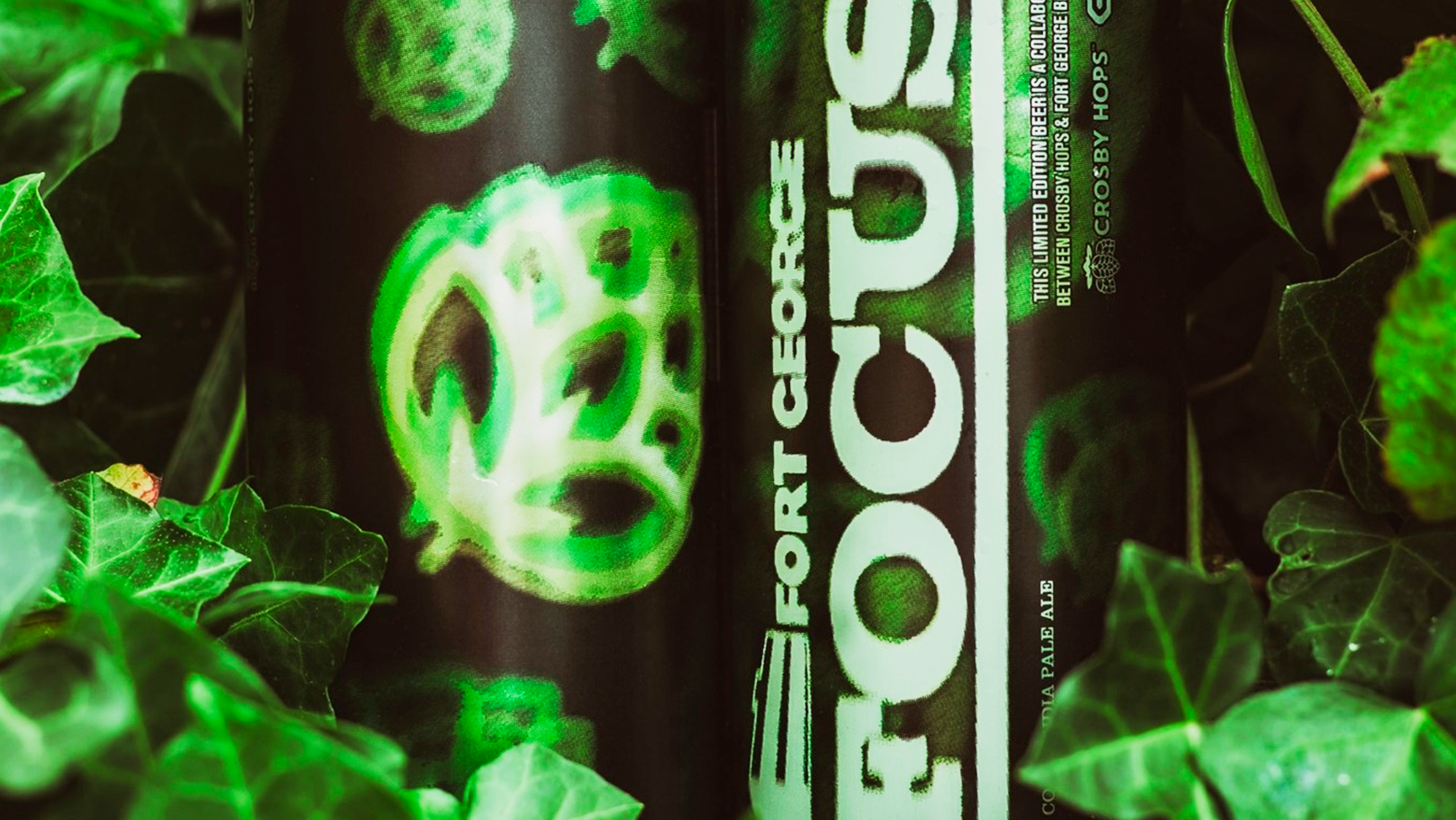
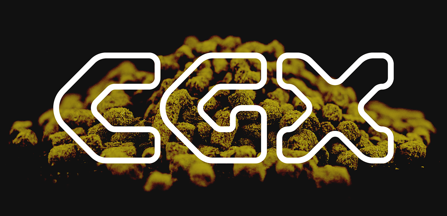
CGX Cryogenic Lupulin Pellets are a cutting-edge hop product and innovative process developed by Crosby Hops, the largest hop grower and distributor in Oregon. As one of only two hop growers in the US to use this cryogenic process to pelletize their hops, this was a major logo and branding project in which I was trusted to own beginning in 2022. Subsequently, Crosby's CGX product and innovation was at the forefront of the company being awarded Portland Business Journal's Manufacturer of the Year in 2024.
COLD
FROZEN
SCIENTIFIC
TECHNOLOGICAL
INNOVATIVE
BOLD
STEP 1
Before sketching starts, subject matter and word associations have to be discussed to help determine the impressions the brand mark should give the viewer. Since CGX was derived as a shorthand abbreviation for cryogenics, cold and frozen were emphasized. Other words CGX represents are scientific, technological, innovative, and bold. It was also important for the brand mark to be as legible as possible due to CGX being an invented abbreviation, not a colloquial term.
STEP 2
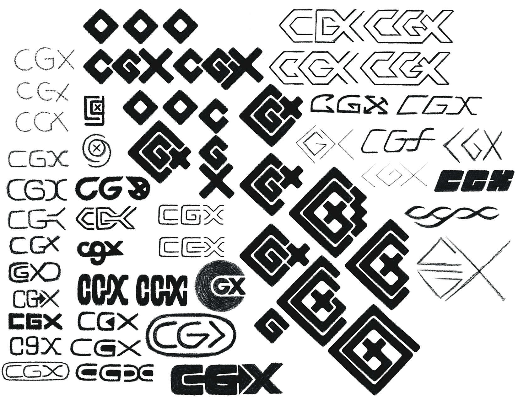
The logo brand mark design begins with rough sketches to explore the shapes and relationship between letterforms, helping to find the geometric similarities and overlap which can create a sense of natural rhythm and cohesion. The letters C and G have very similar structure; getting the X to complement those letters was the tricky part.
STEP 3
After sketching, the directions with most potential are built and explored as vector black and white brand marks to see how well they are working when geometrically sound and at their most minimal form. If the logo passes the black and white test, it will succeed in full color.
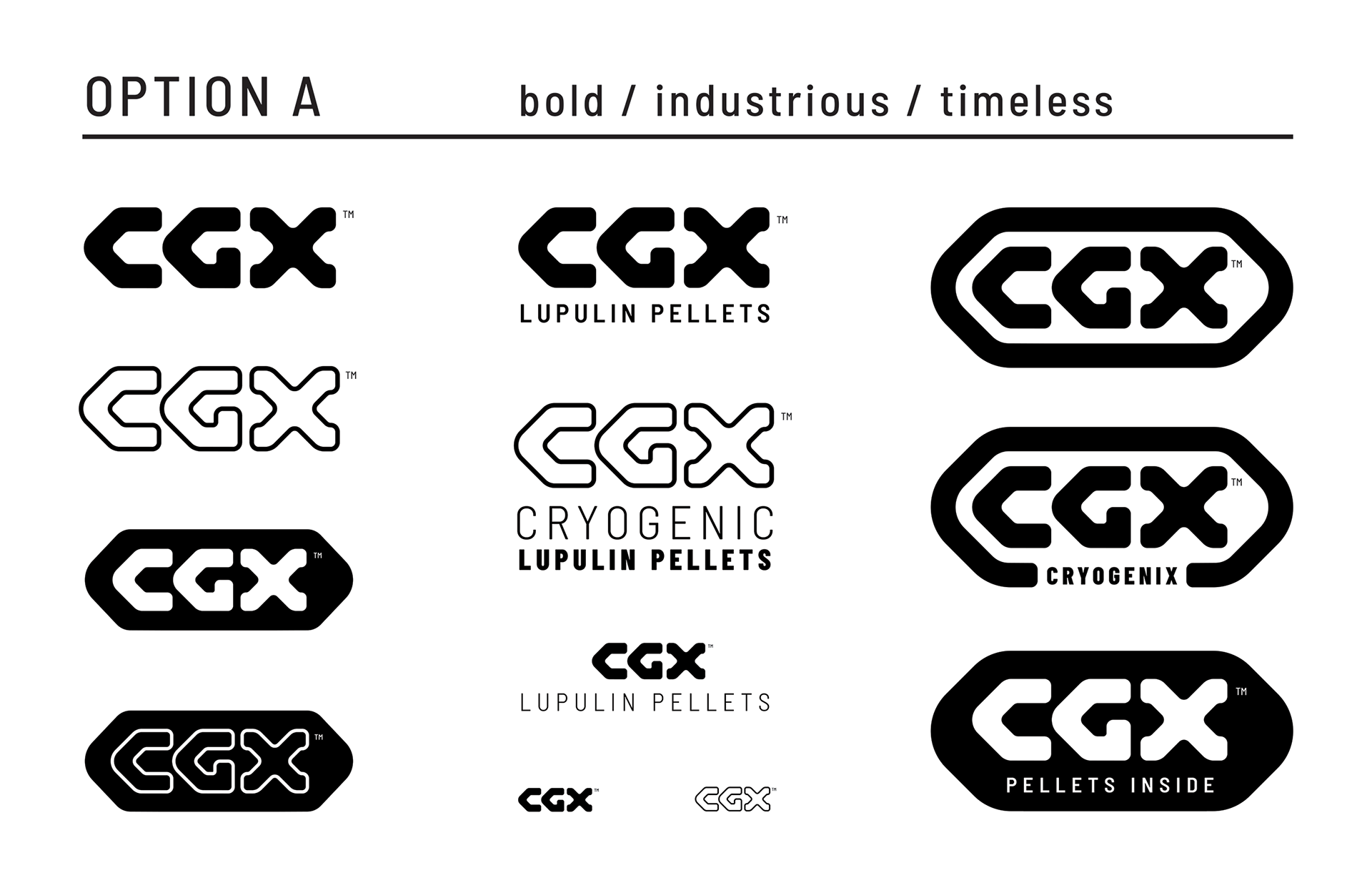
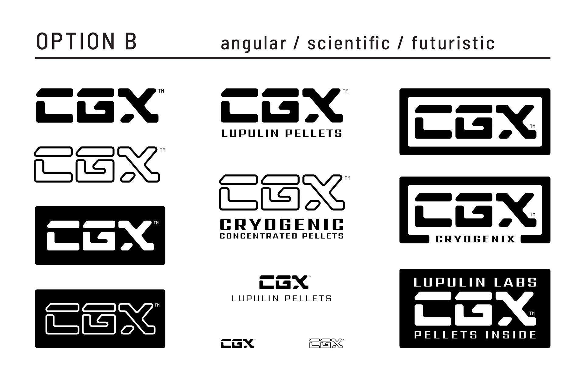
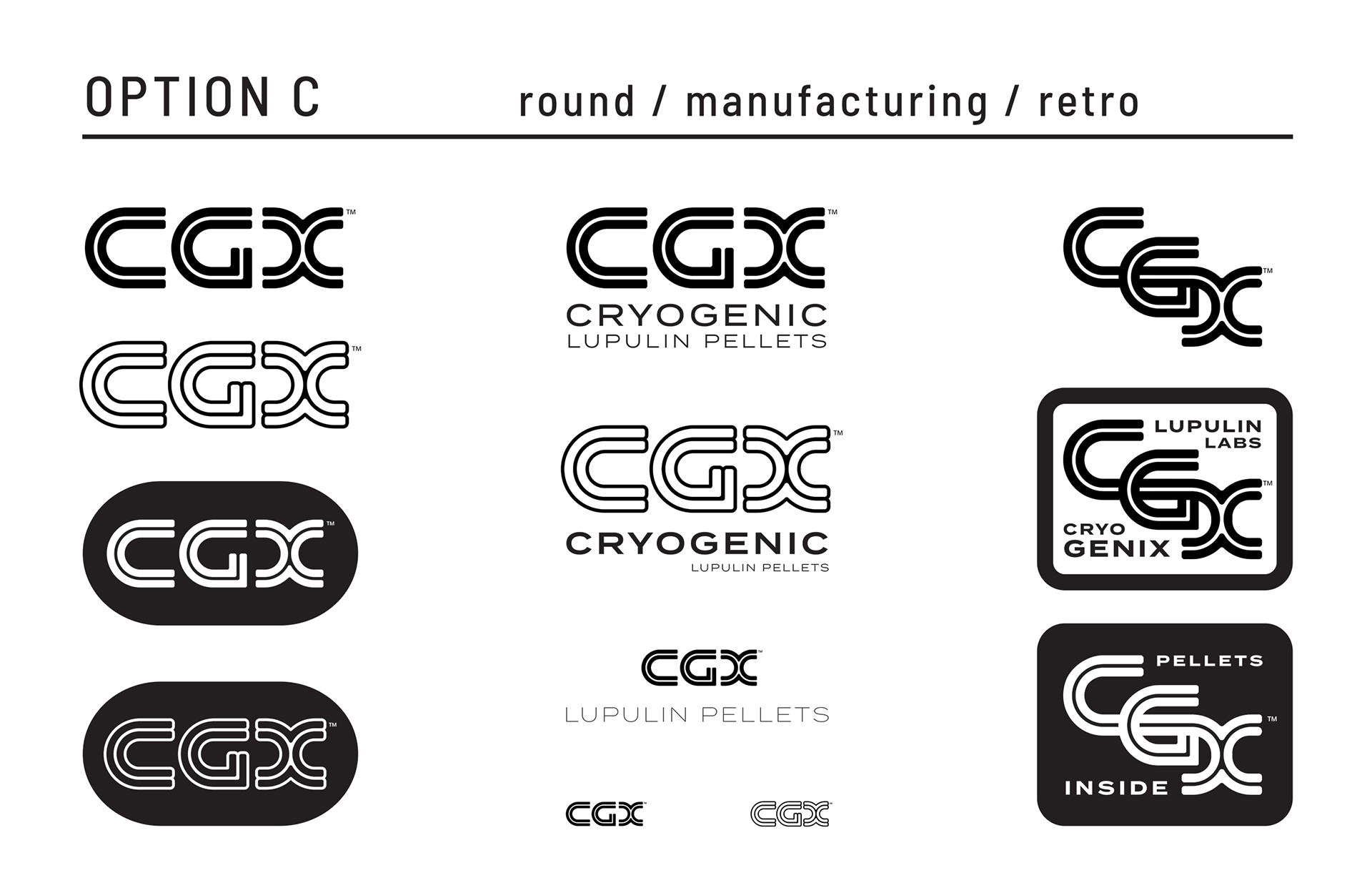
STEP 4
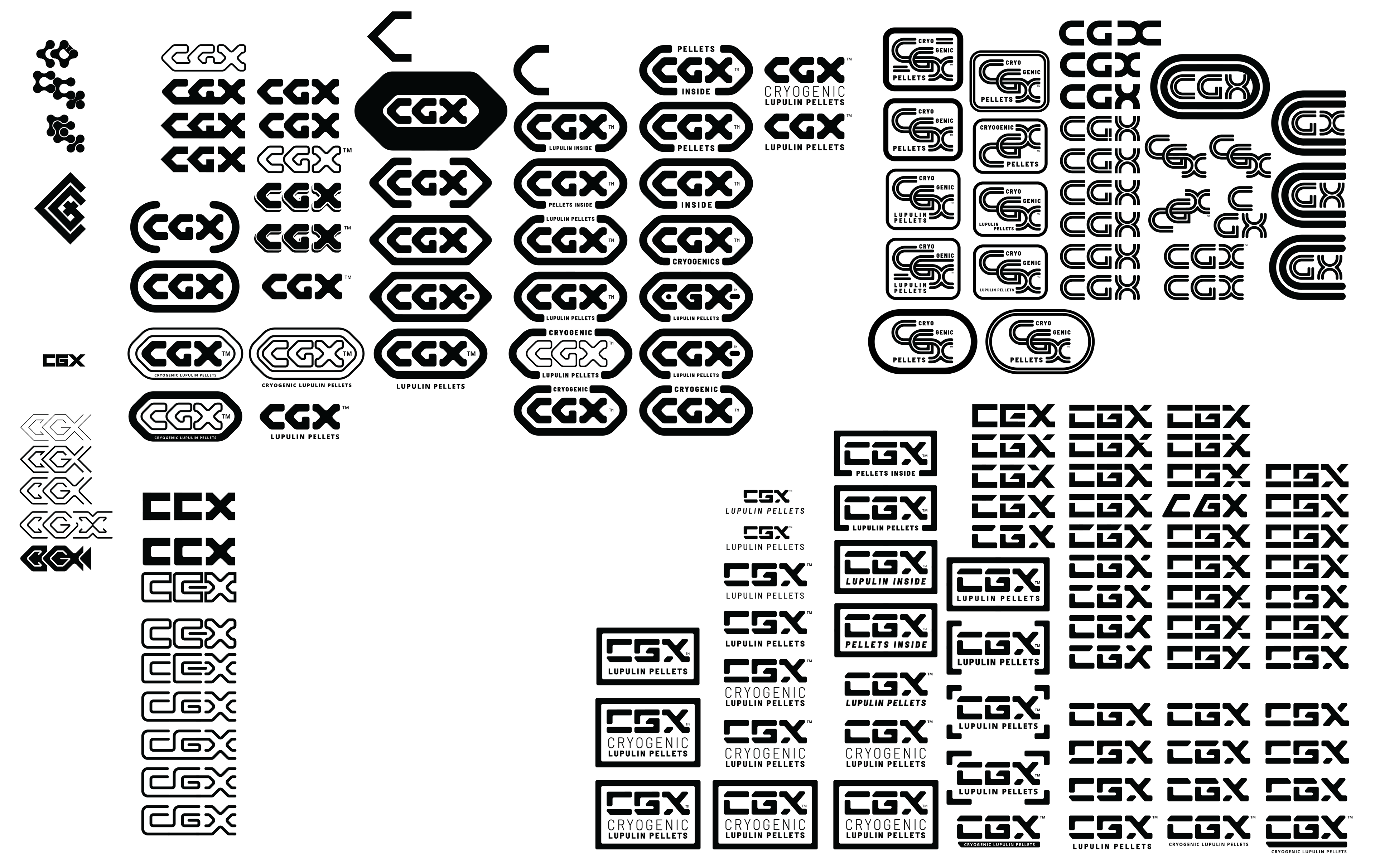
The strongest vector options are presented below in black and white versions, in solid and outline form. The marks are displayed by themselves, as part of lockups, within a variety of container shapes, and at different scales to test their merit.
During this step I traditionally share mockups featuring the logo options to show the versatility of the mark, helping the client to weigh the respective strengths and weakness of each option. Afterward, final revisions are requested, or a winning direction is chosen to move forward as the final brand mark.
STEP 5
After a brand mark is chosen (option A), refinements are requested and made if necessary.
In this case, modifications were explored, but ultimately the logo created in the previous step became the final brand mark.
In this case, modifications were explored, but ultimately the logo created in the previous step became the final brand mark.
Next, color options are presented, each containing three inter-changeable colors. Palettes A and D were the finalists, with D winning, as it is the colorway that most closely exemplified a desired feeling of coldness.

STEP 6
The chosen color palette is dialed in further and standardized color usage is established. Stand-alone brand marks, logo lockups, container shapes, and other requested assets are completed and delivered. Finally, minimum logo-size, distance of clearspace, do-not's and other rules for proper usage are defined and outlined in a brand usage guideline document for future reference.
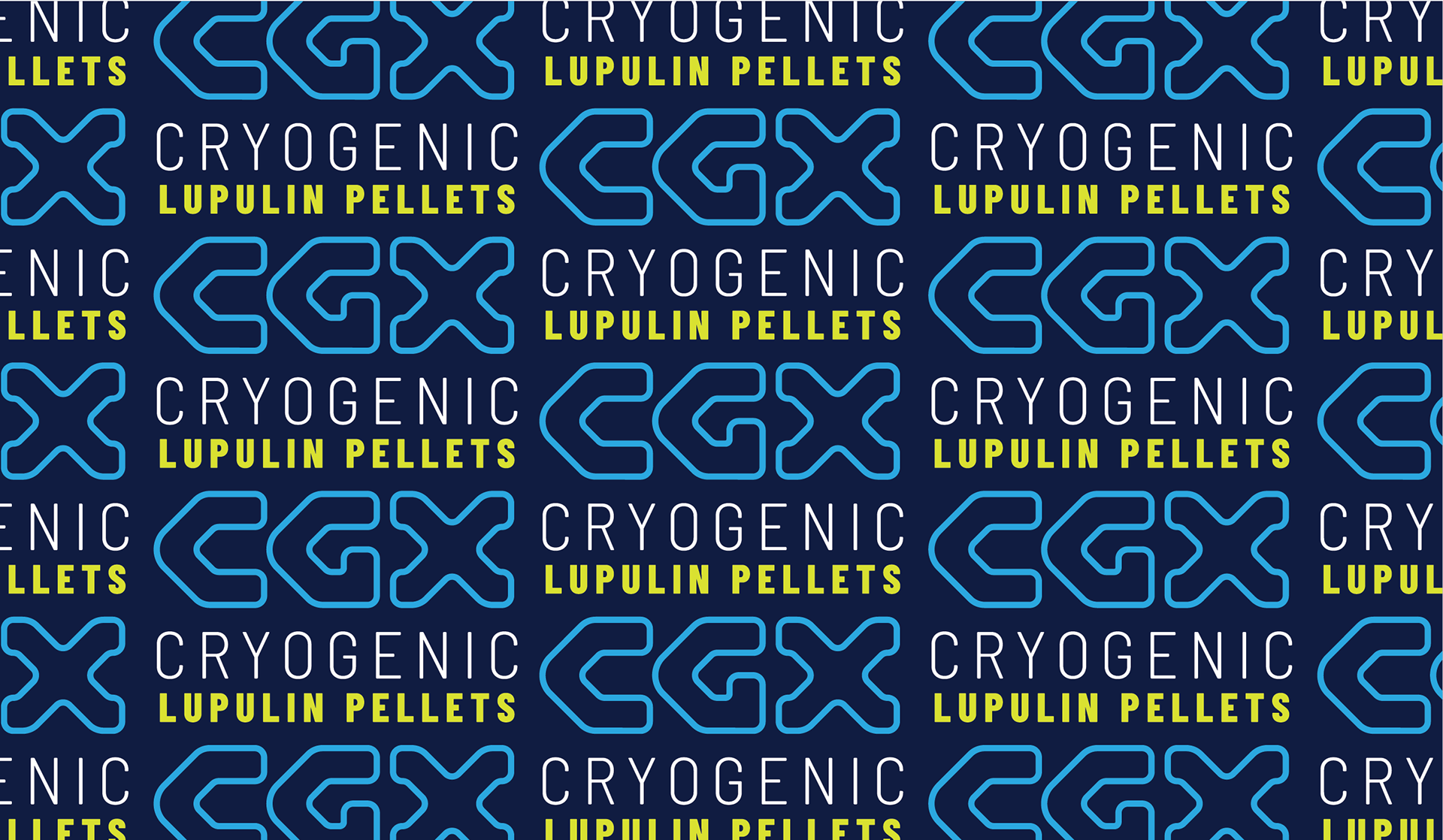
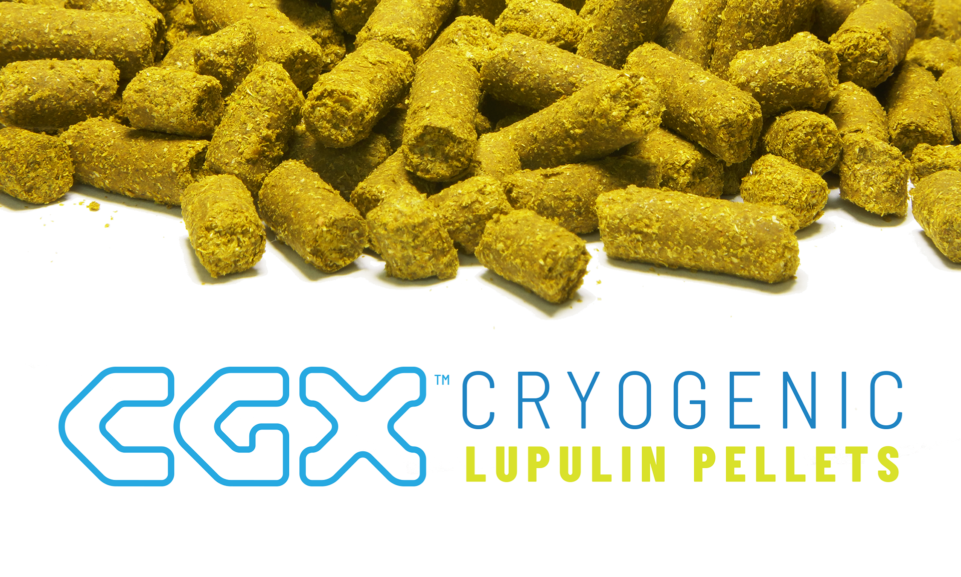
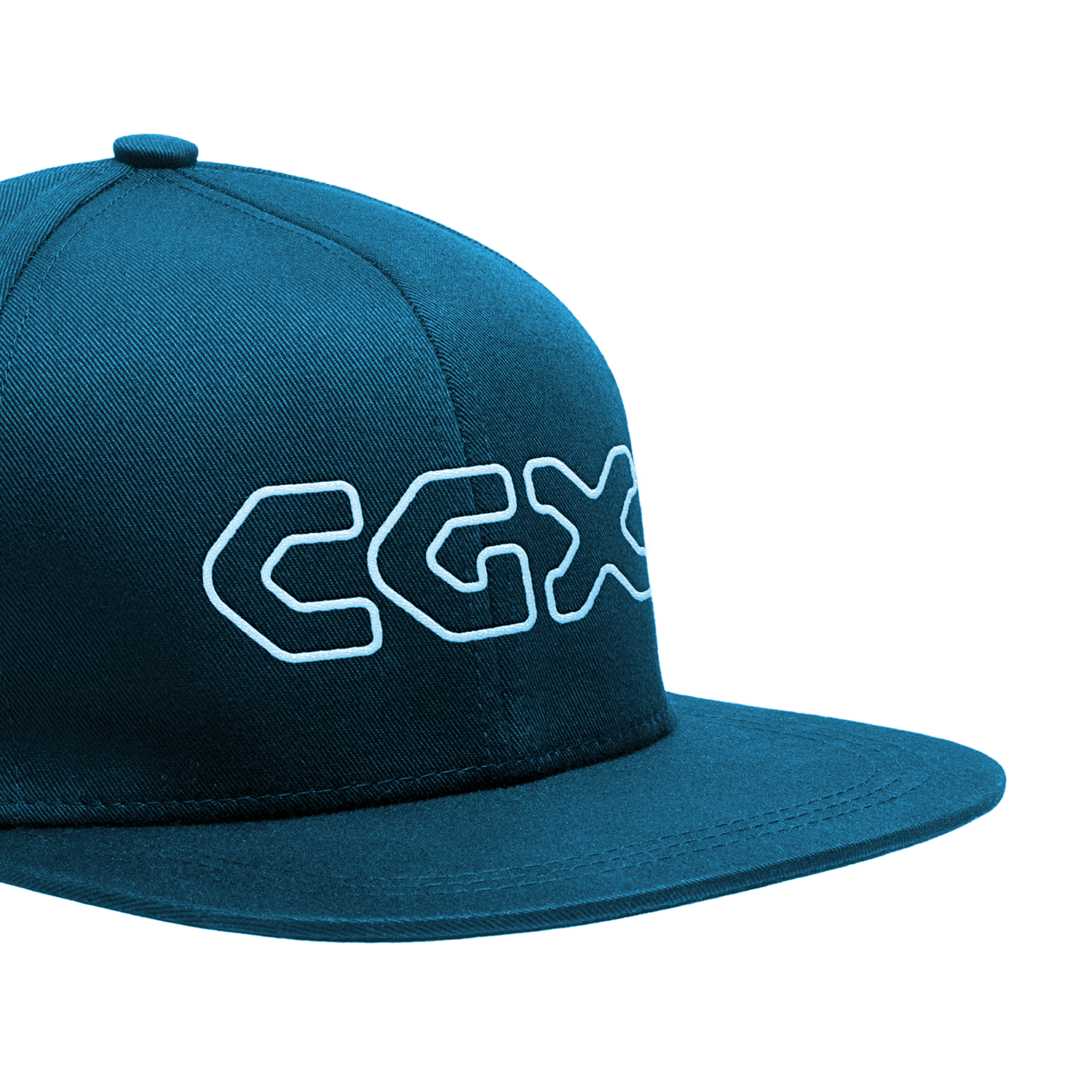
The final brand logos are displayed below, presented in a variety of applications.