Before becoming a graphic designer, one of the industries I dreamt of breaking into and producing work for was beer labels and packaging. There was something magnetic that drew me to the artistic freedom these products granted—even demanded—in order to help stand apart from all other cans and bottles on the busy shelf.
Fast forward a few years, and my goal blossomed into the blessing of having the opportunity to work with some of the best craft breweries in the country. Not only am I very passionate about my contribution, but I’ve been fortunate enough to have tried most of the beers I created labels for—and they’re absolutely delicious! So if you ever visit Colorado, Oregon, or any of the other beautiful states known for great-quality craft beer, make sure to stop by and taste these brews for yourself. Cheers!
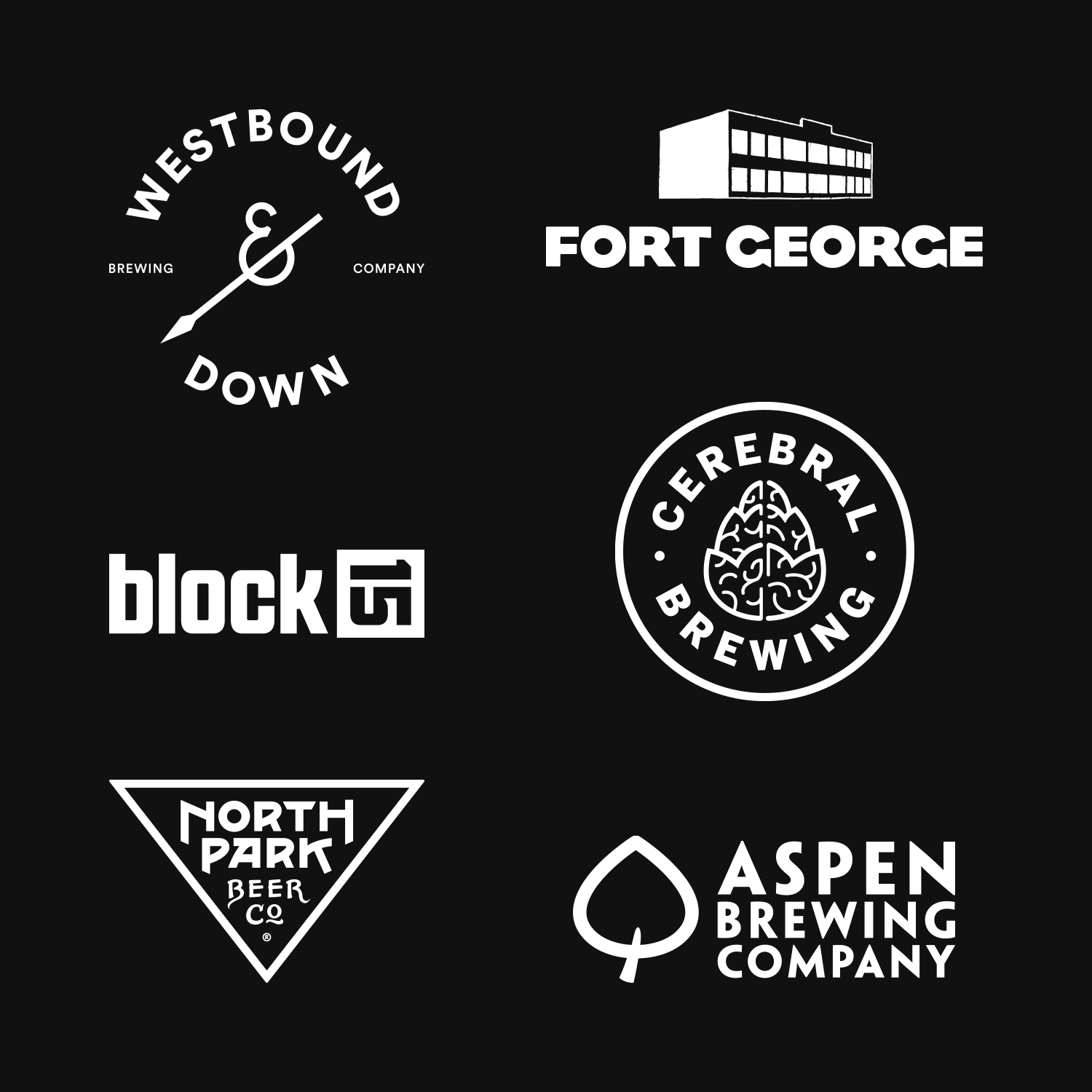
SOME OF THE FINEst CRAFT BREWERIES in the country I'VE BEEN FORTUNATE TO WORK WITH DIRECTLY OR IN COLLABORATION.
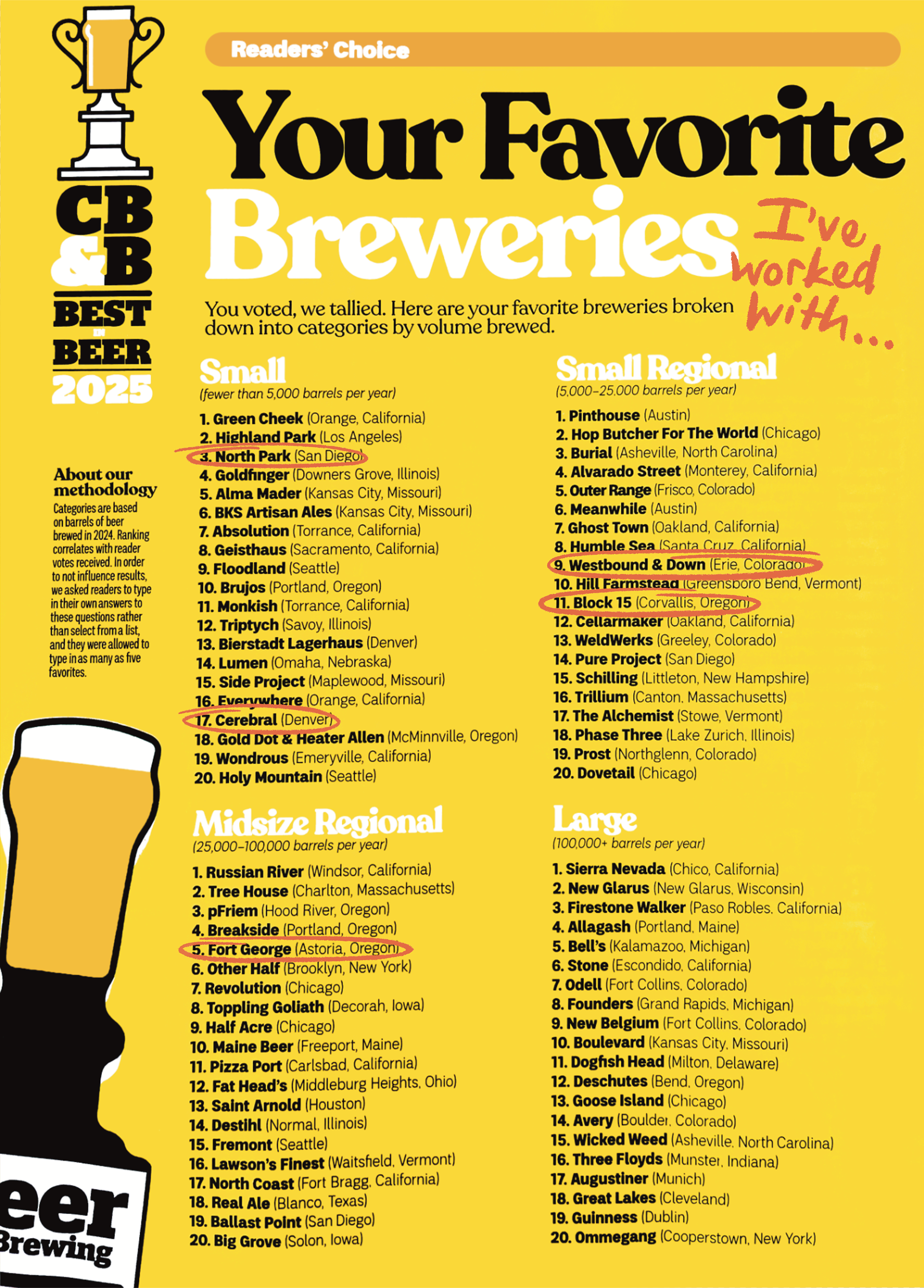
craft beer & brewing magazine READERS' POLL OF THEIR 'FAVORITE BREWERIES' FOR 2025.
BREWERIES I'VE ILLUSTRATED & DESIGNED LABELS WITH ARE CIRCLED.
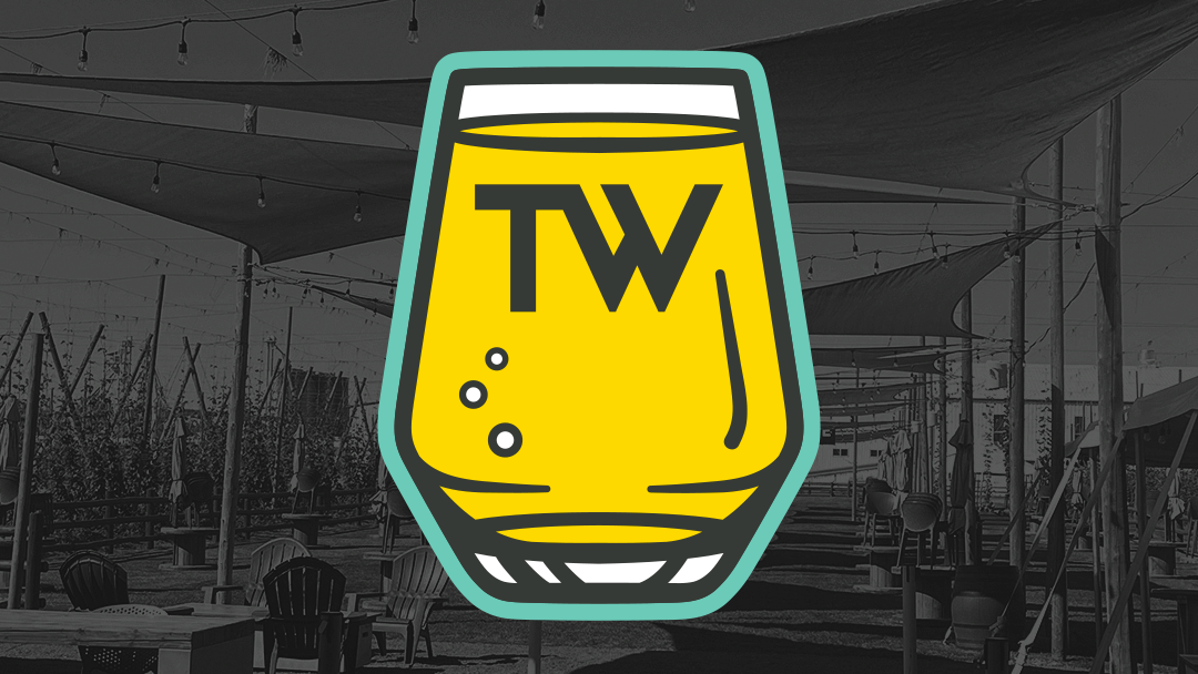
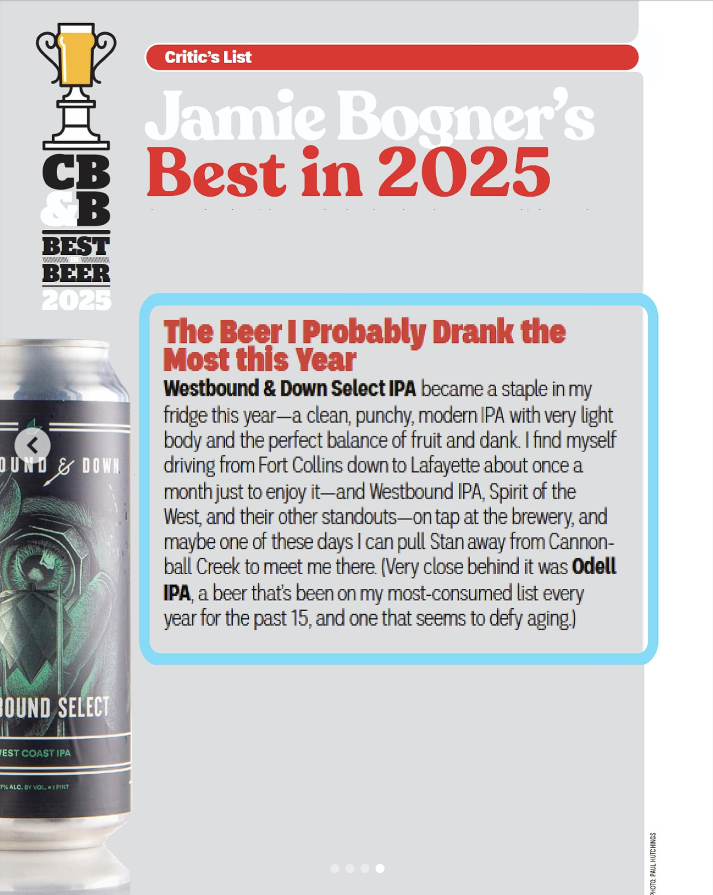
Voted a top-ten favorite Small Regional brewery by Craft Beer & Brewing Magazine in 2025, Westbound & Down specializes in craft beer with deep Colorado roots that aims to infuse the spirit of the West into everything they create. I've developed a great relationship with the brewery over the last few years, having designed many beer labels, along with all other forms of brand assets.
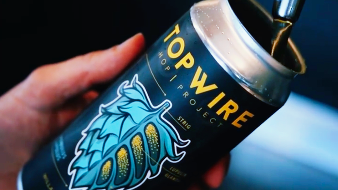
Recipients of the Brewery of the Year award at the Great American Beer Festival in 2025, Westbound struck gold at this event in 2023 with their delicious Westbound Select, taking home first place for West Coast-Style IPA—their first gold in this coveted category.
After winning gold, Westbound decided it was time for Select to be canned and available in the grocer's fridge. It was a quick 'yes' when they reached out to offer me the privilege of creating Westbound Select's first label, and I jumped at the opportunity.
Westbound Select | award-winning West Coast IPA
illustration | Product design | Layout Design
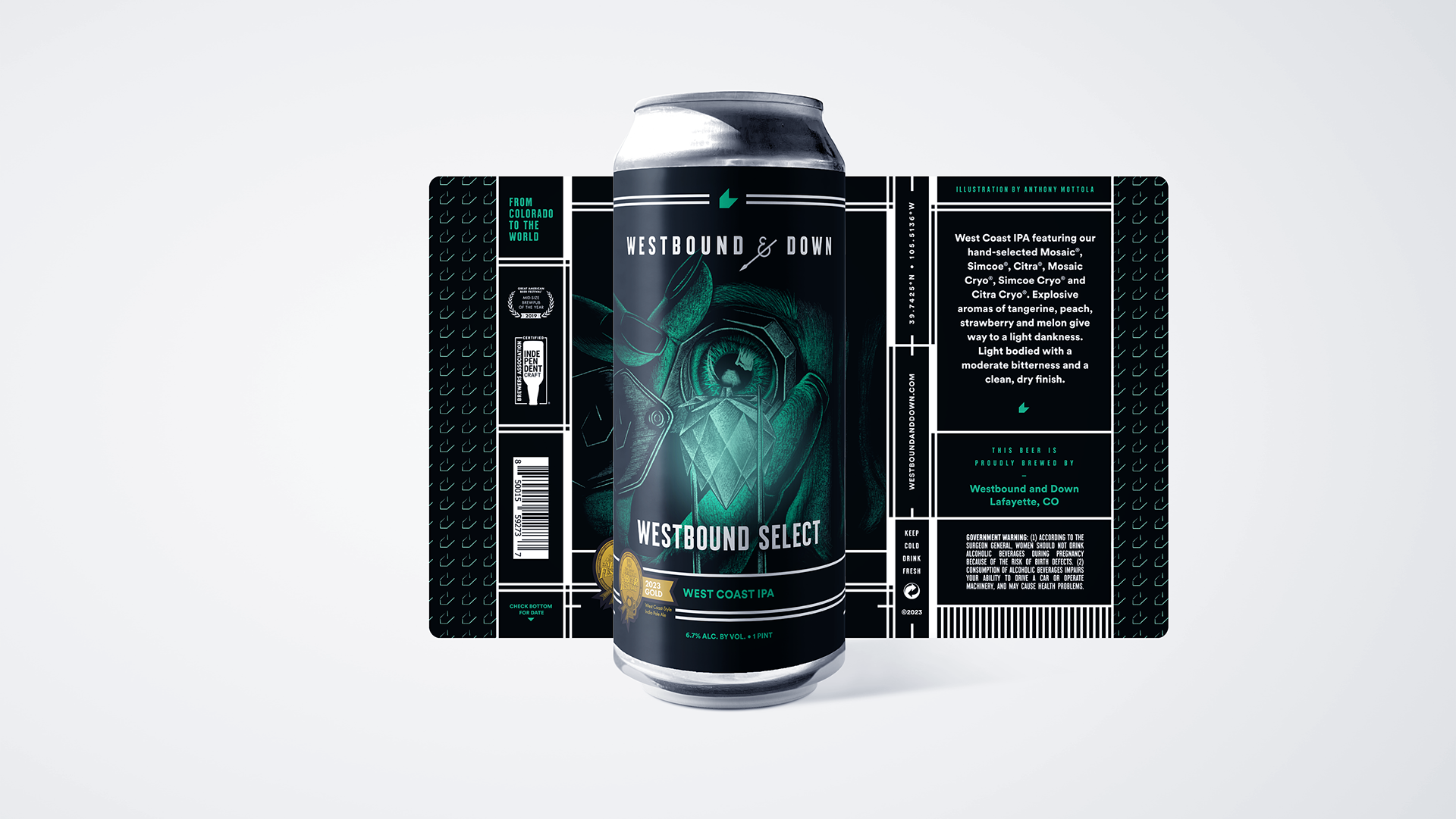
The inspiration behind the label concept came from the hop selection process. Much like the meticulous nature of a jeweler examining a gem stone using a loupe, brewers study the characteristics of hops during the sensory process and hand-select those of the highest quality for their intended recipe.

Four pack of select proudly displaying its GABF Gold.
page of craft beer & brewing magazine highlighting westbound select.
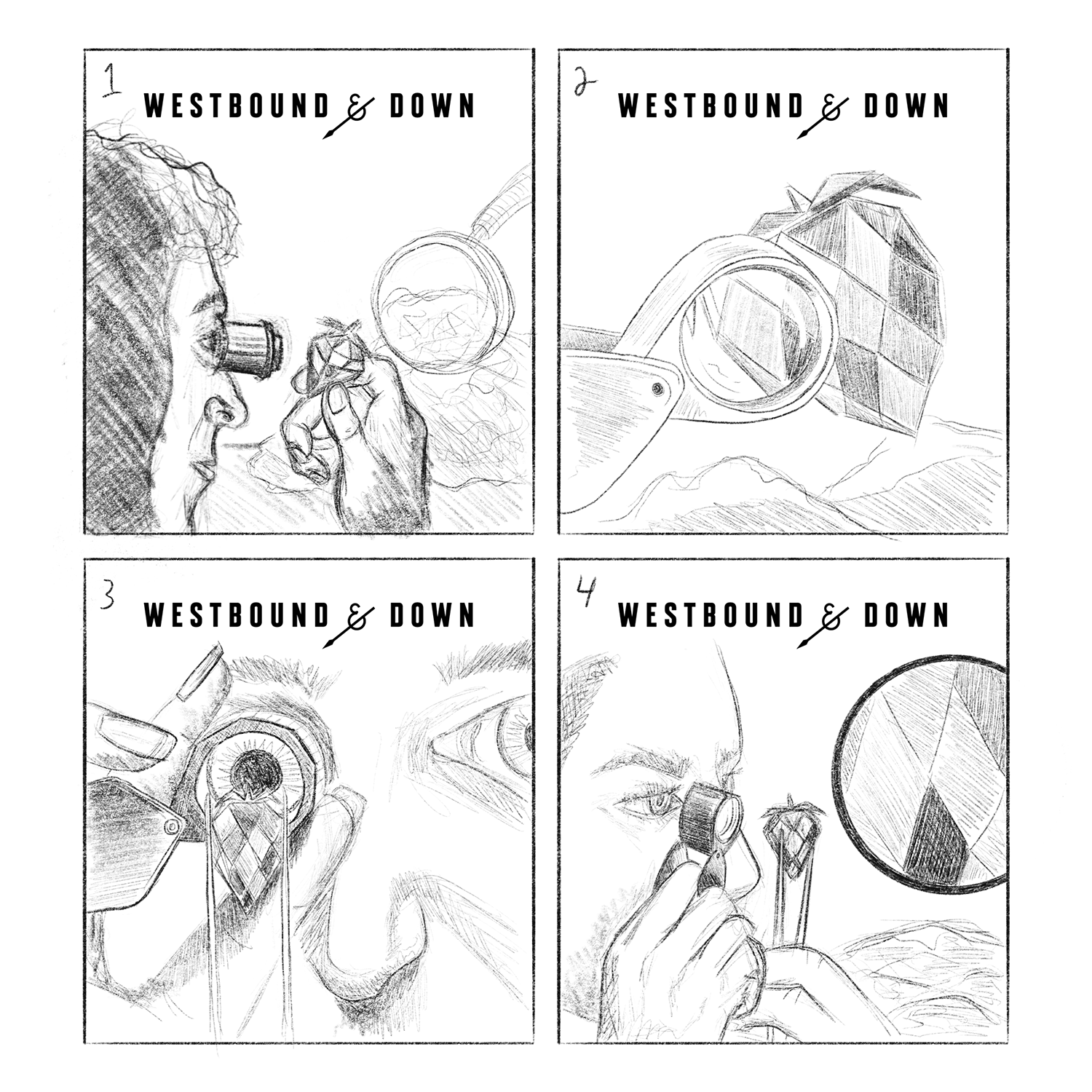
Initial concept sketches. Option 3 was the direction chosen.
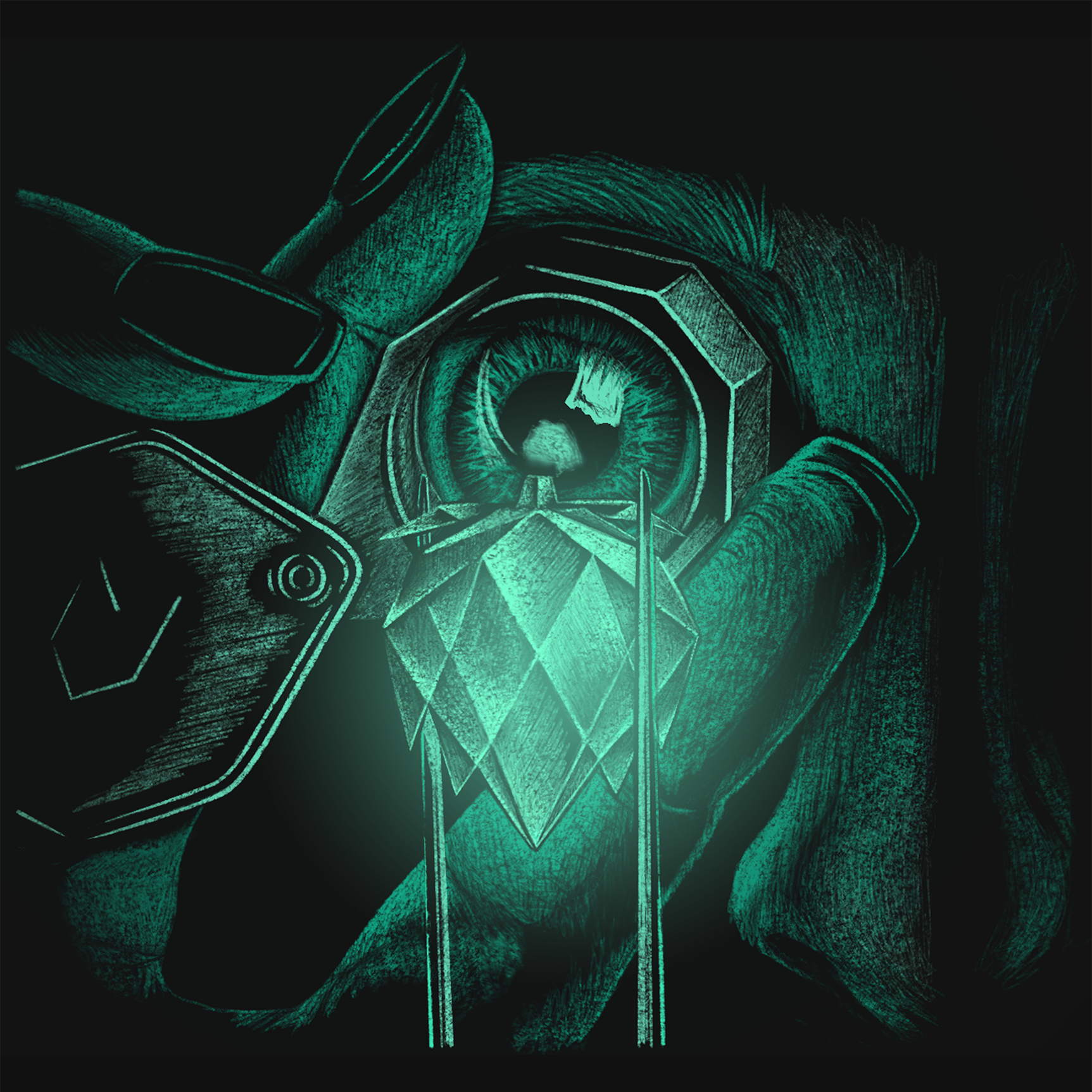
Final Artwork
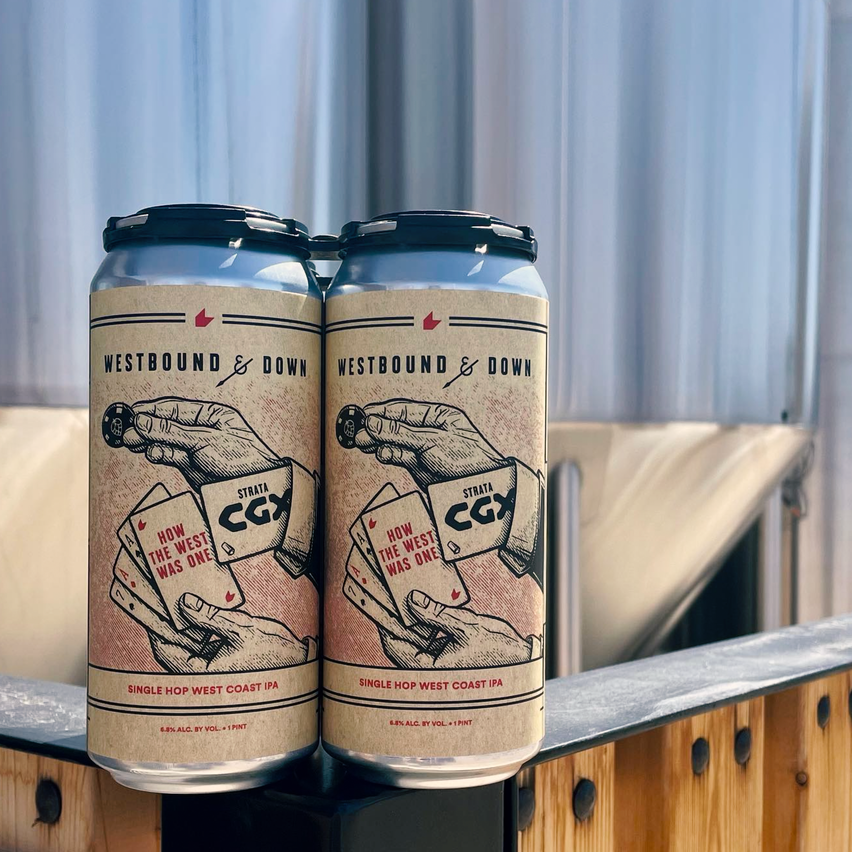
How the West Was One | Single hop west coast IPa series
Product design | illustration | Layout Design
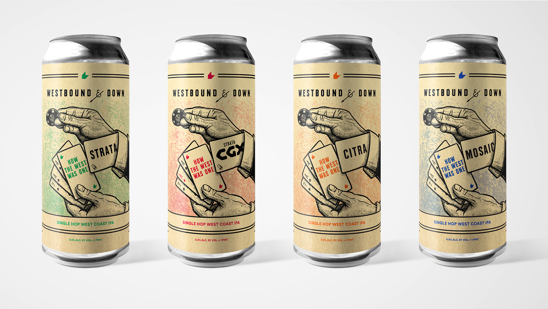
How the West Was One—a series of West Coast IPAs showcasing a single hop varietal—was my first collaboration with Westbound & Down.
Beginning with Strata CGX, which was a featured collaboration between the brewery and Crosby Hops for the Craft Brewers Conference in 2023, I continued to work with Westbound on three more color variations of label artwork which feature Strata, Citra, and Mosaic hops, respectively. This series of beers has become a staple for the brewery and their customers.


Creative Direction: Eric Schmidt | creative Director | westbound & Down Brewing company
One of the preeminent craft breweries in the Pacific Northwest and voted in the top five Midsize Regional breweries in the country by Craft Beer & Brewing Magazine, Fort George Brewery is located in the beautiful coastal city of Astoria, Oregon.
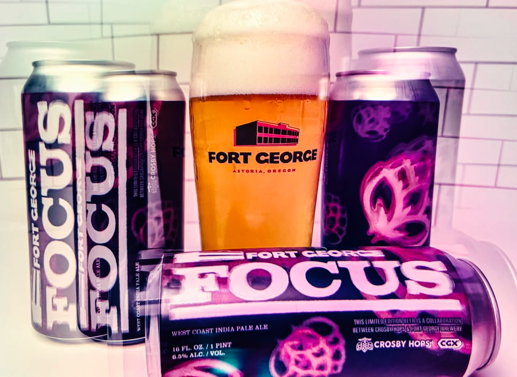
FOCUS was a fall seasonal West Coast IPA brewed by Fort George which appeared on the shelves at all major retailers in the region. Beginning as a Craft Brewers Conference one-off collaboration (blue / purple color-way) with Crosby Hops in 2022, the beer was so well received that it was brewed annually for three seasons! Multiple label color-ways signify different batches with varying hop profiles.
Fort George Focus | Seasonal west coast IPa series
Product design | Image Creation | Color | Layout Design

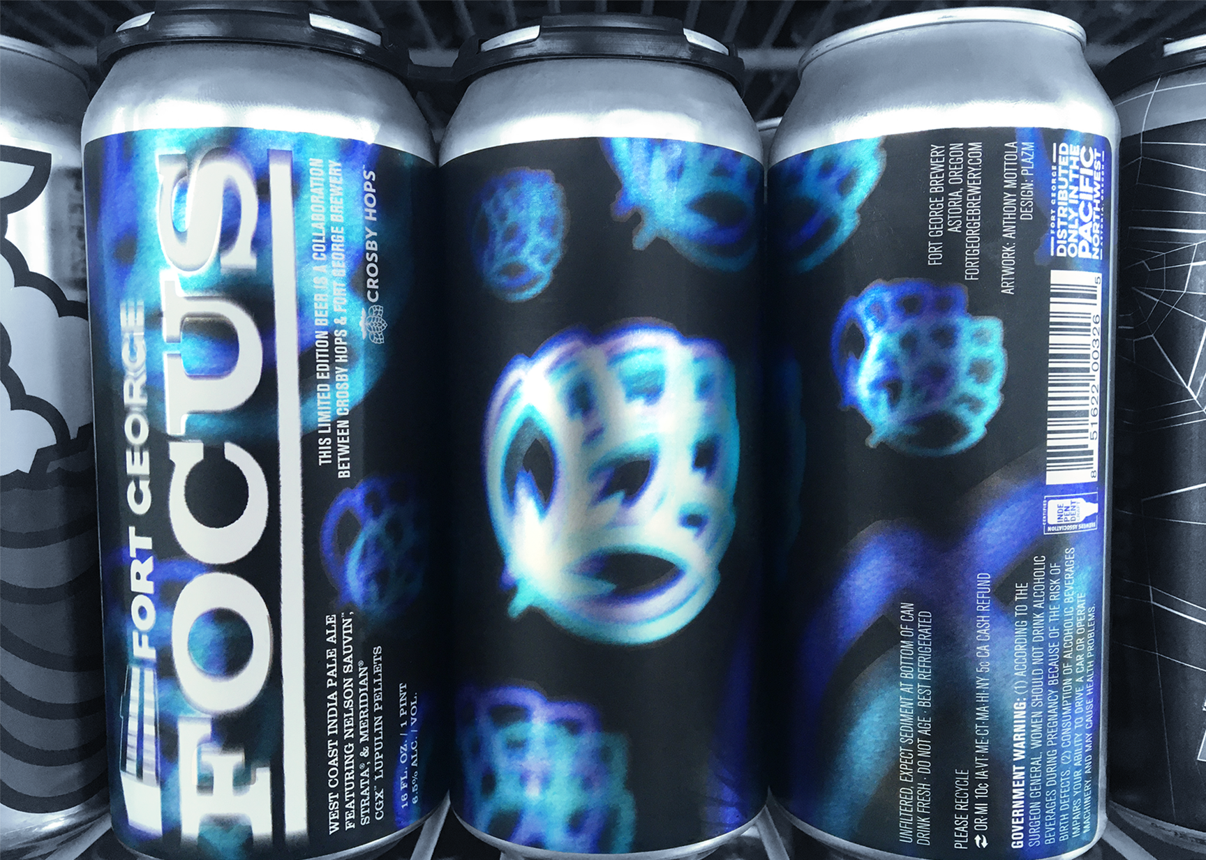
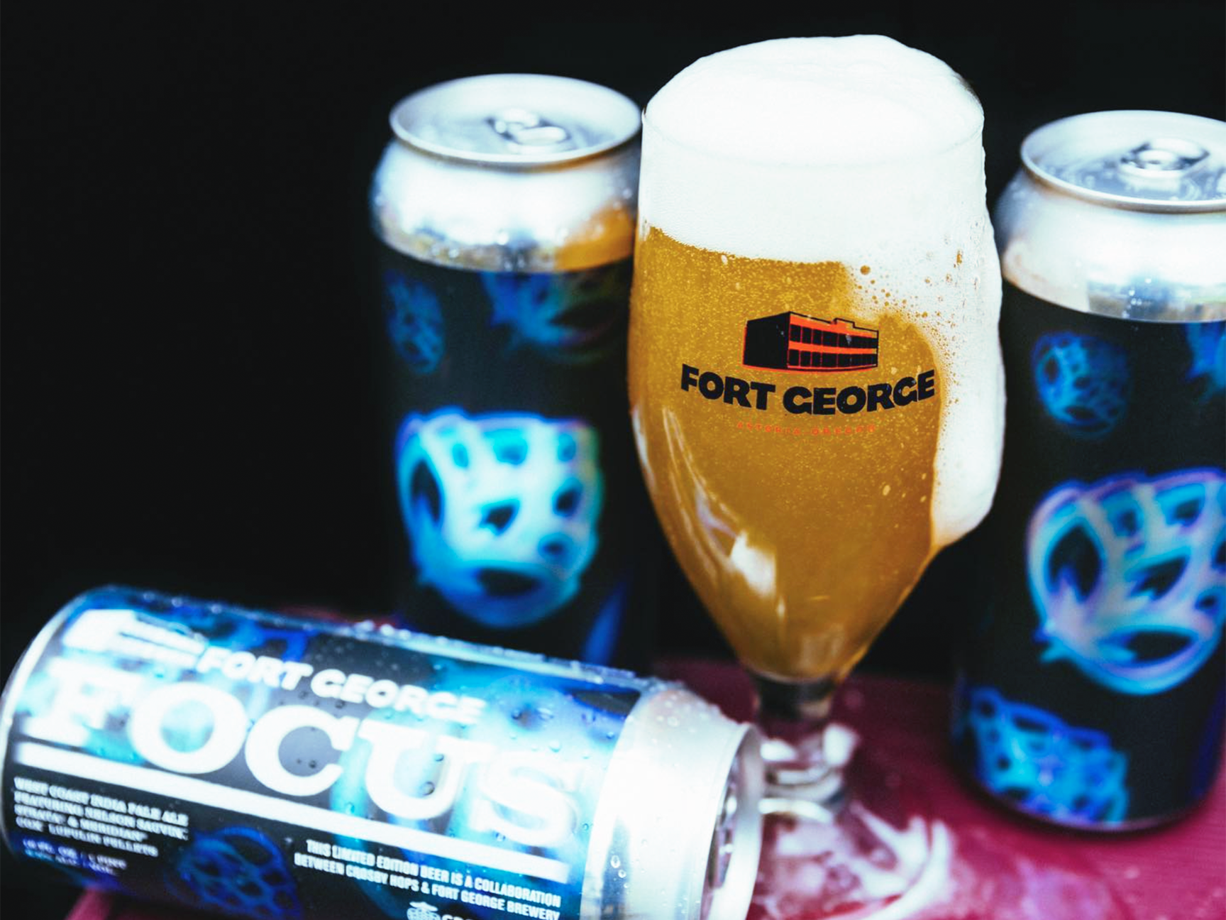
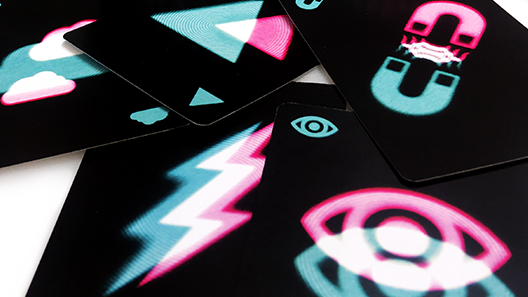
Inspired by and expanding on the aesthetic treatment conceived in my card game MINDBIND, FOCUS label art conveys a depth of field using many pairs of stylized hops which exist on different planes of vision.
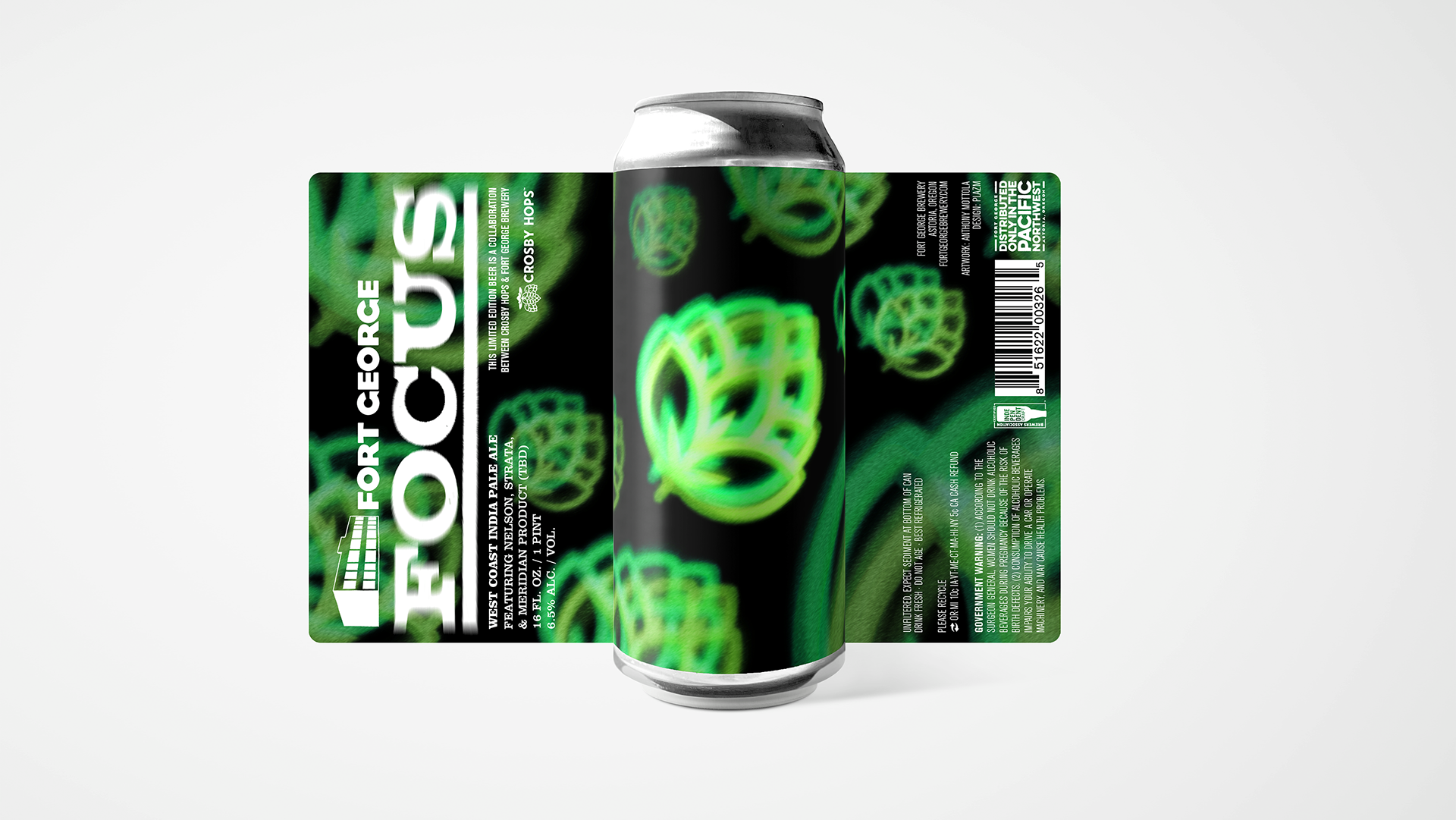
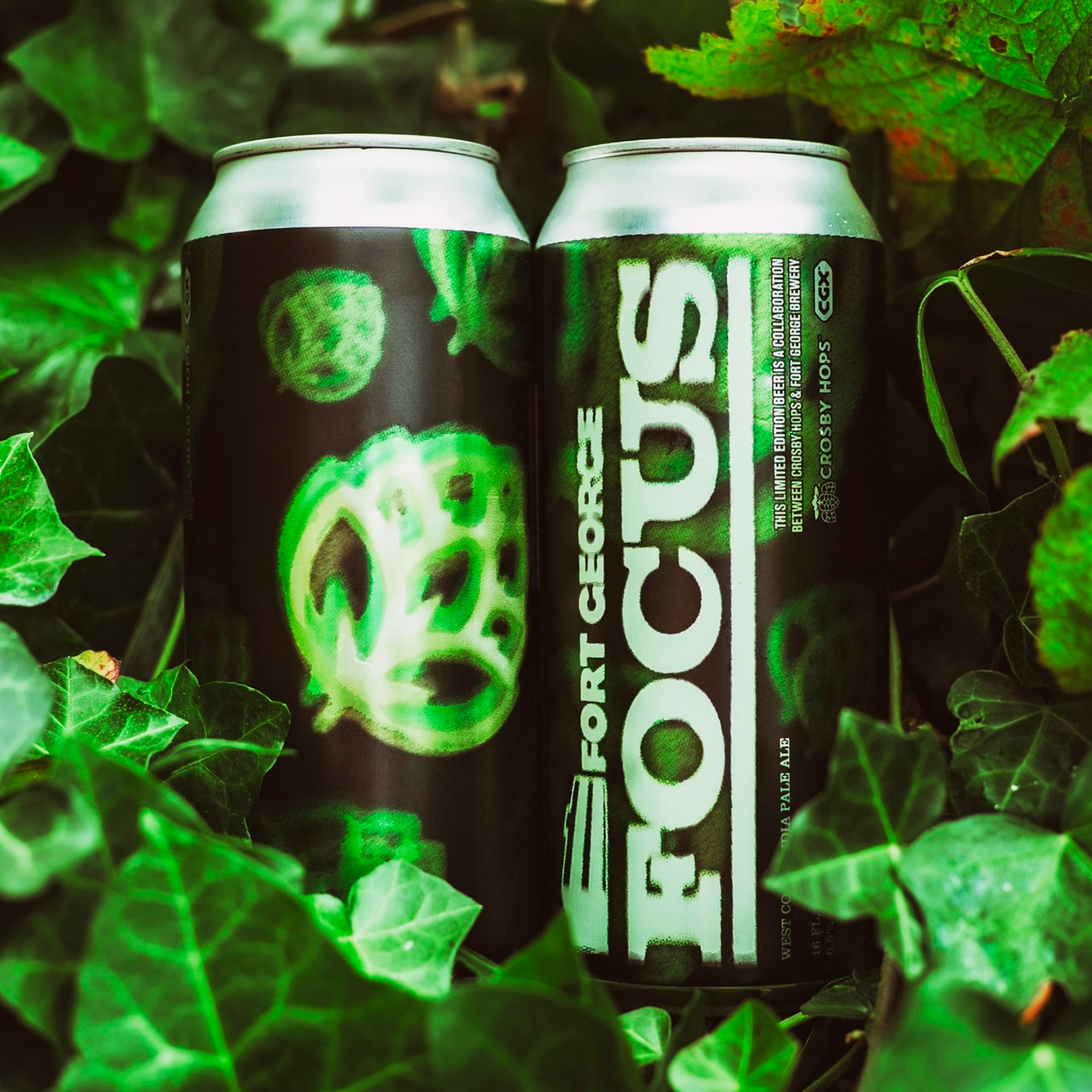
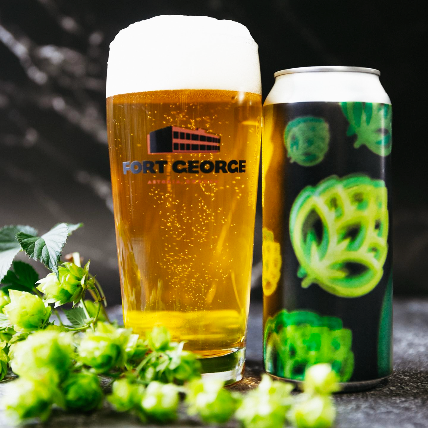
The lone exception to their traditional beer-title typography, FOCUS displays a blurred treatment of its title and Fort George company logo, complementing the graphic concept of the artwork.
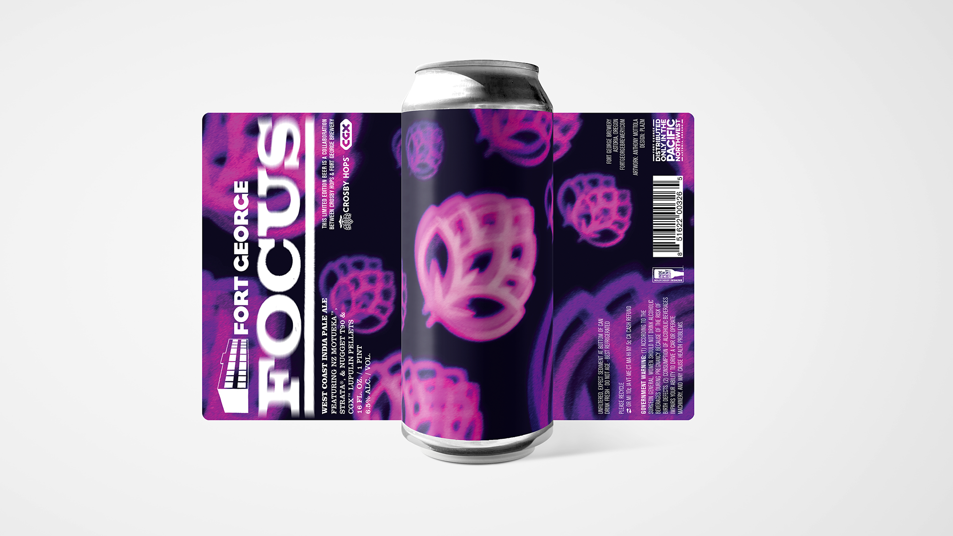
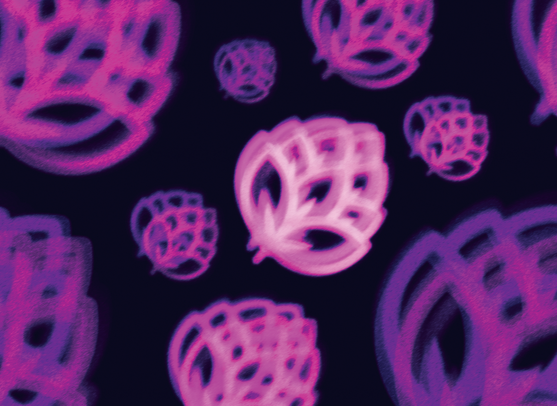
The green and pink color-ways above have been adopted to differentiate the two seasonal batches released annually. Below is early concept exploration. The bottom right was selected by Fort George as the direction for the final label artwork.
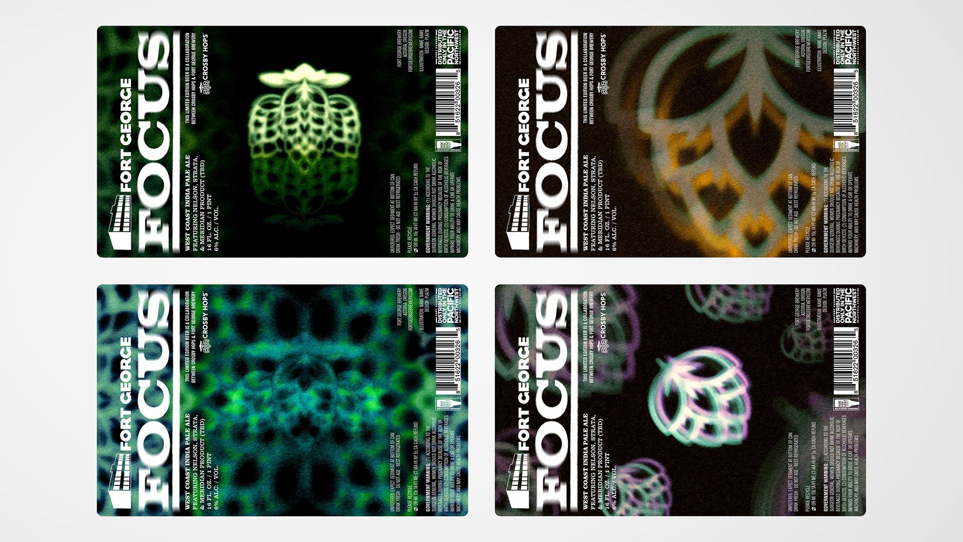
Early concept exploration
Creative Direction: brian bovenizer | marketing & Sales Director | Fort george brewery